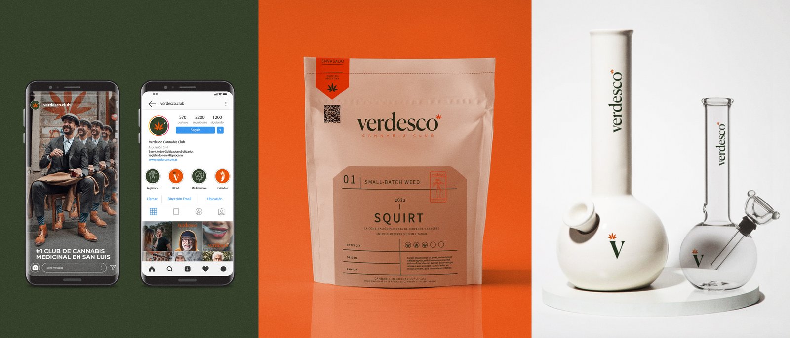
The Strategy
We built a visual language rooted in botany and precision. Moving away from the typical "green leaf" tropes, we developed a system that speaks of science, soil, and premium care. The result is an identity that invites trust from patients and respect from the medical community.
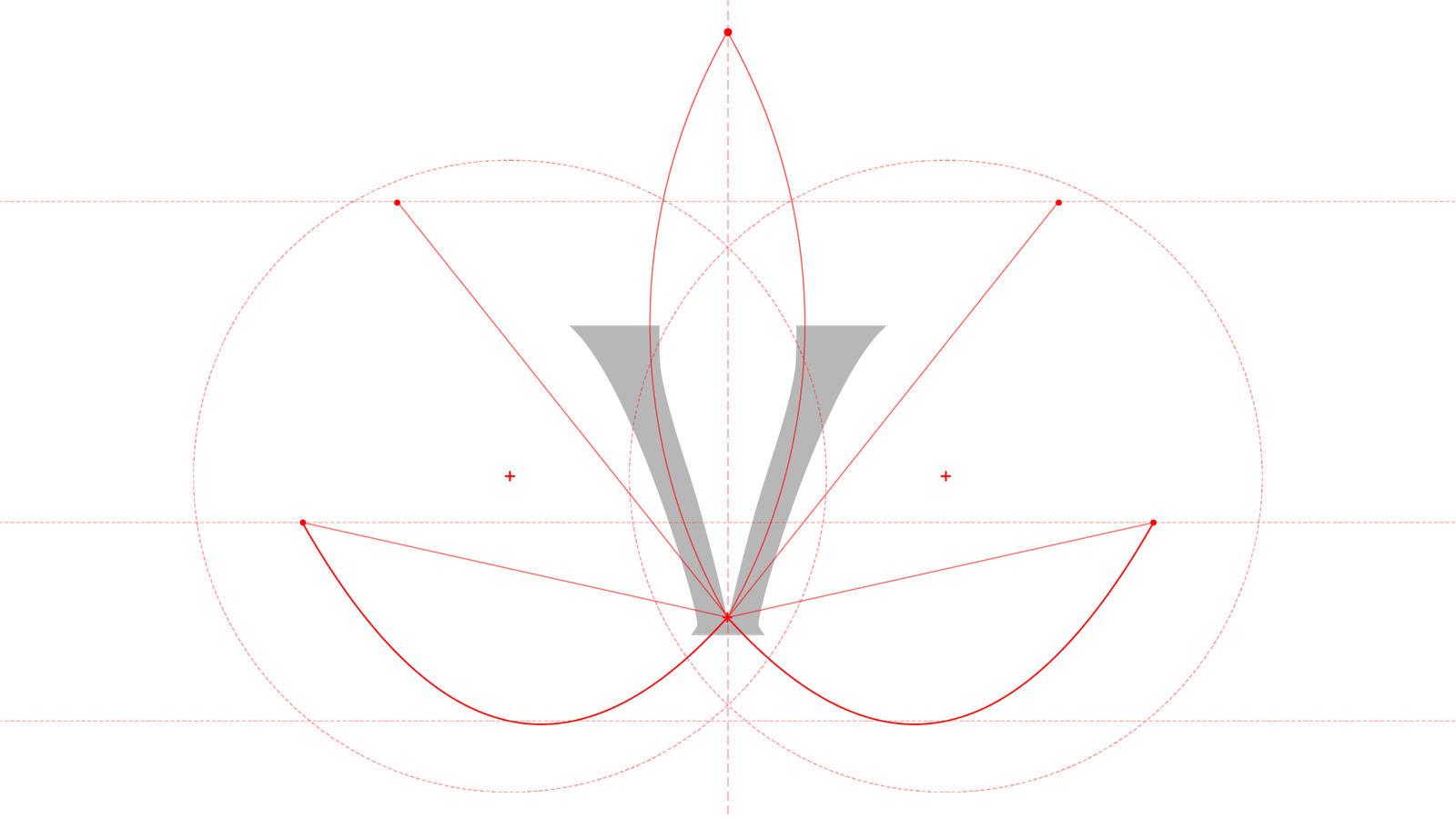
The symbol integrates the cannabis leaf structure with a negative-space "V". It balances organic growth with geometric precision.
The Outcome
Verdesco didn’t just stand out. It reframed what cannabis could look like in Argentina — for people, for institutions, and for the culture.
Is your brand
hiding behind clichés?
Differentiation starts with clarity. Find out if your brand is leading the market or just following the herd.
UNLOCKS A FREE STRATEGIC CONSULT TAILORED TO YOUR RESULT