01 — One question about a shelf
When every craft beer fights for attention with color, we built a black monolith.
Imagine the craft beer aisle. Now imagine pulling out every label, every illustration, every burst of color — and replacing it with a single black object. That image was the starting point.
Argentine craft beer had evolved into a color war nobody could win. Every brand competed through illustration: a fixed label architecture where only the artwork changed between variants. Line up five variants from any brand and what you see is five different artworks that happen to share a logo. The system collapses under its own variety.
Pompe had exceptional beer and a logo that looked like a sneaker brand. The question wasn't how to make it look better. The question was what happens if, instead of adding another colorful bottle to the noise, you place a black monolith in the middle of it.

02 — Black is not a color choice
Black in a colorful category isn't aesthetic — it's positional.
It creates contrast before anyone reads a word. It signals premium without explanation. And it does something the category wasn't doing: it makes a beer look like it belongs in the wine aisle.
That was the idea. Not to compete louder. To play a different game entirely. A brand that a wine drinker would pick up. A system that looked like the craft beer category hadn't caught up to it yet.

03 — Why alchemy
Five alchemical stages. Five beer styles. One transformation.
The five stages of the alchemical process — Nigredo, Viriditas, Rubedo, Albedo, Citrinitas — mapped directly onto the five beer styles. Each variant became a phase of a larger transformation, not a standalone product with a different illustration. Porter is Nigredo: raw matter, darkness before change. Honey is Citrinitas: the golden awakening, the final transmutation.
The concept also captured something honest about the craft itself. Unlike industrial brewing, craft beer is inherently variable. What the industry treats as inconsistency, alchemy reframes as the nature of the process. The beer isn't unpredictable. It's alive. Transformation is the product. Not flavor. Not style. Transformation.

04 — System first, illustration third
The illustration doesn't disappear. It becomes texture.
Pompe inverts the standard hierarchy. Complex engravings were pushed into the background using sectored lacquer on a black base. The illustration doesn't disappear. It becomes texture. It rewards close attention without demanding it from across the aisle.
What leads from a distance is the system: the label architecture, the gothic typographic structure, the stage name, the alchemical symbols. The brand is legible before the illustration is visible. Gothic typography wasn't nostalgia — it was category displacement.

05 — Designed to survive reality
Every element was built with a simplification path.
Remove the sectored lacquer. Keep the gothic type, the stage names, the black base, the alchemical symbols. The system still reads. The world still holds. That's the difference between a visual identity and a brand system.

01 — Two things that shouldn't coexist
We come from a laboratory. But we're exclusive like Apple.
That sentence doesn't describe a brand. It describes a tension. And that tension was the brief. LYRN/ was built from scratch — no name, no concept, no direction. What the client had was an instinct: they didn't want to look like anything already out there.
The work wasn't to design a brand. It was to find the gap nobody else was occupying and build a world inside it.

02 — The gap between the spa and the pharmacy
Two crowded extremes. One unclaimed space.
Skincare operates at two extremes. On one end: the wellness aesthetic — botanical photography, soft palettes, the visual vocabulary of cucumbers and calm. On the other: clinical skincare — white packaging, medical typography, efficacy through sterility.
Between them was something nobody had claimed: the precision of a laboratory with the coherence and desire of modern premium design. Not a pharmacy. Not a spa. Something that felt like science had been filtered through the same obsessive attention to detail that makes an Apple product feel inevitable.

03 — Protocol, not product
Five products. Five steps. Nothing standalone.
Most skincare brands sell outcomes — hydration, glow, anti-aging. LYRN/ reframes the category: the product isn't a cream. It's a step in a controlled sequence designed to restore barrier integrity under stress. Five products. Five steps. LYRN/01 through LYRN/05. Reset, Renew, Rehydrate, Stabilize, Protect.
The naming isn't cosmetic — it's structural. Once you frame skincare as a protocol, industrial naming is the only honest choice. Anything warmer would be a lie.

04 — Cold system, warm people
The system tells you this works. The people tell you this is for you.
The visual system is cold by design. Dark packaging, technical typography, clinical precision. That coldness isn't a risk — it's the mechanism that earns credibility. But no one buys science. They buy the version of themselves that science makes possible. Photography does the work the system can't.

05 — A different frequency
It doesn't look like skincare. It looks like skincare hasn't caught up to it yet.
That's not a visual accident. It's what happens when every decision — naming, packaging, photography, typography — derives from the same founding tension rather than from category conventions. The laboratory and Apple, coexisting. Exactly as intended.

01 — What nobody wants to admit
A medical treatment doesn't have to be a miserable experience.
My mother had cancer. So did my aunt. When someone you love goes through oncological treatment, you start to understand something conventional medicine rarely says out loud: the treatment itself can be as devastating as the disease.
Cannabis appeared as an alternative — not as a cure, but as a tool to live better while the treatment did its work. But accessing that tool in Argentina meant navigating between two worlds that represented almost nobody. Neither was a place where a mother with cancer felt welcome. That was the first thing I understood when Verdesco arrived.

02 — Stigma as a design problem
The law opened the door. But the stigma was still there, waiting on the other side.
Argentina has a cultural history with cannabis that's hard to ignore. REPROCANN changed the legal framework. Mamá Cultiva had proven that the problem wasn't medical but cultural and political. Verdesco's challenge wasn't to convince anyone that cannabis worked. It was to convince people they could access it without feeling like they were crossing an invisible line.

03 — The grandparents' last name
Argentine soil as a natural provider of sustenance.
Verdesco is the surname of the founders' grandparents. Italians who came to Argentina and discovered that here, you could plant anything and it would grow. That image lives in the name before any design decision begins. Verdesco was conceived from the start as a family of collective work — not a company, not a clinic. A family with the purpose of helping people live better.

04 — Legitimacy without distance
A brand a mother with cancer can show her doctor.
The result is a brand a mother with cancer can show her doctor, that a young person can carry without feeling they need to explain themselves, and that an institution can take seriously. Today, Verdesco has research agreements with universities and public health centers. The brand opened doors that with any other image would have been impossible.

01 — It doesn't build. It reorders.
Tolken doesn't build new infrastructure. It reorders what already exists.
Tolken uses the rails that already exist — the same ones everyone uses — and reorders them in a way that optimizes the system, reduces the cost of the process, and creates a margin that was previously lost to friction.
No new visual languages invented. Take the ones that already generate trust in the financial world and reorder them so the result feels different without feeling strange. Familiar but not generic. Trustworthy but not distant. The brand does what the product does.

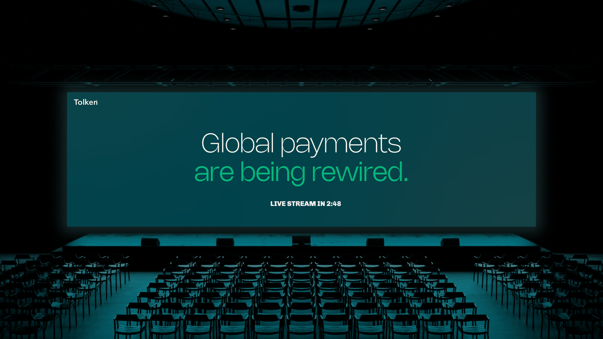
02 — Global payments are being rewired
Not a product promise. A declaration of an era.
The tagline came with the client. I insisted on using it — not because it was a good line, but because it was an image. "Are being rewired" isn't a marketing claim. It's a declaration of an era in passive voice: something is happening, the global payment system is being reconfigured, and Tolken is part of that movement.

03 — Against corporate illustration
Trust without distance. Solidity without institutional coldness.
Fintech has its own clichés — simplified characters in flat colors, connectivity iconography, the corporate blue that signals trust without risking saying anything more. Tolken needed trust without the distance. The decision was to go architectural: a light visual system, with breathing room, that compensated for the inherent density of the information the brand handles. Minimal not as a trend. As a conscious compensation.

04 — A symbol that moves
The movement had to be designed first. The static form is its consequence.
The symbol needed to work in motion before working in static. A static symbol that got animated afterwards was the wrong order — the movement had to be designed first. The result is a spiral of concentric layers that condenses the ideas of rewiring, movement, and continuous dynamic. In static it suggests process. In motion it demonstrates it.
Tolken has since raised two funding rounds. See tolken.co

01 — The place nobody knew how to own
The precision tool space was available for whoever arrived with a real system.
The technical tools end of the Argentine paint market already existed. There were brands trying to stand there — moving away from decoration, talking to the professional, selling performance instead of color. The problem was they looked exactly like what they claimed to be. Plastic tools. No system, no intention, nothing that generated trust. The paint could be good — but the brand inspired nothing.

02 — Two markets, one decision
To sell to a municipality, good pricing isn't enough.
Muralux had competitive pricing with quality product — which opened a possibility most brands hadn't considered: wholesale sales to municipalities for public works. To sell to a municipality, you need the brand to communicate seriousness, performance, and institutional reliability before anyone opens a tender. The brand had to work as a letter of introduction at a table where decisions are made by volume, not by taste. The solution was in the name.

03 — Muro + Lujo
Two words. One positioning.
Muro anchors the brand in the structural — the wall as a work surface, not a decorative canvas. Lujo opens the door to aspiration without betraying the technical axis — not the luxury of the ornamental but the luxury of the well-made, of what lasts, of what doesn't fail. The name allows the brand to speak to a construction company with the same coherence it uses to talk to someone renovating their home.

04 — A tool that looks like one
Don't decorate. Structure.
The logo derives from the stroke of a 9-inch roller. 45-degree angles that communicate stability and movement at the same time. An expanded typography that occupies space with authority. The design decision was the same as the business decision: don't decorate, structure. A system equally solid on the side of a 20-liter bucket, on the door of a delivery van, or on a painter's uniform on a job site.

05 — When the brand does the selling
A brand that generates trust before anyone opens their mouth is a sales tool.
The real test of Muralux isn't whether it looks good in a presentation. It's whether a municipal purchasing manager can make a trust decision before anyone explains anything. A brand that needs to be explained to generate trust isn't working. That's what Muralux had to be. And it's exactly what it looks like.